A luxury New York City apartment from the early twentieth century
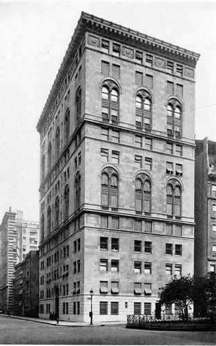
The limestone-clad building, seen here in 1922, was designed by
James E. R. Carpenter and was converted to a co-op in the 1940s.
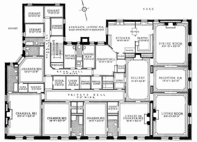
For insight into how wealthy people lived in New York City in the early 20th century, go to this recent
New York Times article about the apartment building at 640 Park Avenue and East 66th Street, and click the image of the floor plan to enlarge it. It is amazing.
(The image you will see at the
Times is larger and clearer than the one I am showing here).
The building is 12 stories high, and each floor is occupied by one apartment, and evidently they all have the same floor plan.
We are familiar with 19th and early 20th century mansions and large houses with several floors and servants’ rooms perhaps in the attic. A huge, one-floor city apartment with servants’ quarters and bedrooms for six servants is a whole other thing.
The way architect James Carpenter solved the problem—and this is what most interests me about the floor plan—was by designing the servants’ quarters and the family’s quarters as parallel yet entirely separate and unconnected spheres—and all on one floor. The servants’ area, consisting of six servants’ bedrooms, bathrooms, and hallway, is tucked away, entered via the kitchen through the Servants’ Hall, perhaps a common socializing and eating area for the servants as well as a place for work, which then issues into the Rear Hall, which passes the Second Man’s room and the Butler’s room, then takes a right turn and goes back to the four small servants’ rooms. The other main hallway, the Private Hall, connecting the family’s bedrooms, is parallel to the Rear Hall yet divided from it by elevators and closets.
However, on closer inspection, you can see that there is a direct connection between the family’s quarters and the servants’ quarters, a doorway near the master bedroom (in the lower left corner of the apartment) that connects to the Rear Hall. This would make sense assuming that the bedroom “above” the master bedroom is for a baby or small child, and the nanny would need direct access to it. If not for that door, the nanny would have to do a long circuit of the entire apartment to get from her room to the baby’s room.
Now think of how a guest entered the apartment. He exits the passenger elevator into a small lobby, about 6 by 9 feet, then enters the apartment itself. First comes the Gallery, then the Reception Room, then the Living Room to the right and the Dining Room to the left.
Suppose a guest is in the Dining Room or Living Room and wants to use the bathroom. From the Dining room he walks into the Reception Room, then the Gallery, and from there into the Library. The Library has an adjoining bathroom. The bathroom is well removed from the common socializing area.
The building still exists. Here is a real estate agent’s advertisement, offering one of the apartments for $ 23 million.
The real estate agent shows a floor plan of the apartment today. You go to that page, and on the right there’s a rectangle that says Plan and you click on that.
I found this by accident. When I had trouble finding a copy of the Times article with a floor plan large enough for posting, I googled “640 park avenue,” and came upon the advertisement.
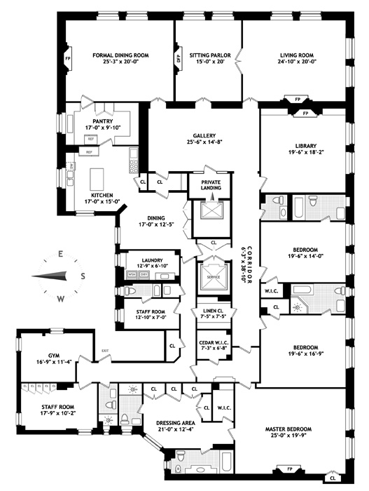
It’s the same plan, though turned 90 degrees, and with the functions of some rooms changed, and with a couple of rooms combined into one. The Second Man’s room has become a laundry room (in 1914, each apartment had its own laundry room in the basement of the building); the Butler’s Room has become “staff room.” Two of the servants’ rooms have become a gym. The other two servants’ rooms have become a staff room. The baby’s bedroom adjoining the master bedroom has become a dressing room. The Servants’ Hall adjoining the kitchen has been converted into an informal dining area.
The service elevator is still the service elevator. The gallery is still called the gallery.
Discussion
Laura Wood writes:
Everything is well thought out. Interestingly, the butler and the second man are given significantly bigger rooms.
LA replies:
The smallest servant’s room is really very small, something like 7 by 10. But then beyond that room, she had this large wonderful apartment to work in.
I find this floor plan inspiring. (When I was 14 and 15 years old, inspired by Frank Lloyd Wright’s houses, I used to design houses—the floor plan, not the exterior, as I had no artistic ability.)
Laura Wood replies:
Yes, she wouldn’t need a big room because she would be living in a place of grandeur. It would be unpleasant if those servants rooms were shared by more than one person.
Why do you find it inspiring? [LA replies: Because it’s a great design, with many parts within a larger whole, all fitting together.]
It’s very cool that there is a service elevator. The servants could comfortably do their work in an entirely separate sphere.
LA replies:
You wrote:
“It’s very cool that there is a service elevator. The servants could comfortably do their work in an entirely separate sphere.”
That’s the sort of insight that only you would have: that the separation of spheres served not only the convenience of the residents, but that of the servants as well.
LA to Dean Ericson:
You can see it’s the same floor plan, with slight modifications, as in the servant’s hall is now a second dining room, and two servant’s rooms have been changed into a gym.
Dean Ericson replies:
Servants are down to two in the modern version, but two of the former servant rooms have been combined to make one larger room for his modern replacement. And notice in the original it is frankly called “servant.” The modern liberal performs his uplifting magic by referring to them now as “staff.” The nursery room has been transformed into a large “dressing area,” since the modern woman has no need of nurseries and all that baby bother. But she does need enormous closets to hold all her possessions, since, as the realtor’s listing assures us, “the building is close to world’s best shopping.” Formerly, each apartment had laundry facilities in the basement. Now, one of the servant rooms (the “second man”—what modern would consent to being a “second man”?) has been converted into a laundry, where the man and lady of the house—or maybe the man and man, or woman and woman, or whatever—can do their own laundry when the staff is off.
In both you see that a visitor first enters, upon exiting the elevator, into a small “lobby” (in the original, “private landing” today), and then into a larger “gallery.” The unfolding of small space to large is pleasing. Originally, the gallery would have been a sumptuous setting for new guests to linger, admire the paintings on the wall, sculptures, collectibles, bric-a-brac, take off their coats and warm themselves by the fireplace. That original gallery only opened onto the reception room, by a grand, arched entry (with a smaller door to the private hall). By contrast, the modern visitor still progresses from elevator, lobby, and into the gallery, but now the grand entry to the reception room is reduced to a small doorway and two new small doorways have been added to allow access to either the dining room or living room. The passageway to the private hall has been completely opened, unfortunately reducing the gallery to a mere extension of the hallway. A visitor no longer stops to warm himself by the fire because the fireplace has been removed from the modern gallery. We’re in a hurry to get somewhere else, you see, so no lingering around admiring the paintings. (The modern paintings are inscrutable, anyway, so it’s best to move along.)
Originally, the guest would proceed from the gallery to the reception room, where he could see, at each of the long sides, a grand arched entry into adjoining rooms. The dining room, reception room, and living room were originally “enfilade”—with doorways aligned so that standing in one you have a long view of the room’s progression—a pleasing sight, and making of the three rooms one grand space, when needed. The modern has done away with the enfilade and created three closed-off rooms. The reception room is a now a “sitting parlor,” which does look cozy, with the fireplace taken out of the gallery set in the wall formerly opening onto the dining room, but I wonder who actually uses it? The living room and dining room are likewise closed-off spaces. This speaks of changes in socializing, where our predecessors entertained more often and drop-by guests were always expected, the custom of “calling hours” not yet vanished, when guests could stop by unannounced and present a calling card to the butler, and expect to be received in the reception room. Nowadays, nobody stops by without being invited, and we’re all too busy to just drop by anyway, and entertaining at home is done far less often. And when we’re home we’re often holed-up in our own spaces watching TV, or computer screens, or playing Xbox, or talking on the phone. We need private spaces, not public ones.
One other change: Originally, the public bathroom adjacent to the library opened into the library and was shared with chamber # 3. Now, the library’s closet has been converted into the public bathroom and chamber # 3 has sole use of its bathroom. That’s a good change because now guests using the public restroom do not disturb a person at work in the library/office. Plus, the guest is relieved not to have someone sitting just outside the bathroom door involuntarily hearing his excretory functions. Much better to enter and exit the guest bathroom from a hallway, a space where nobody lingers long.
Posted by Lawrence Auster at January 06, 2012 02:39 PM | Send