The geographical location of the races in U.S. cities
I am skeptical of digital cartographer Eric Fischer’s much-discussed colour-coded
maps showing the racial breakdown of large American cities, based on the 2000 census. Look at his map of New York City, for example. Is all of Manhattan below Harlem, with the exception of Chinatown (which is green), all-white, as indicated by its solid reddish-pink color? Of course not. It is very mixed. Perhaps whites are the plurality throughout the main part of Manhattan, but the map makes it look as though the area is all-white.
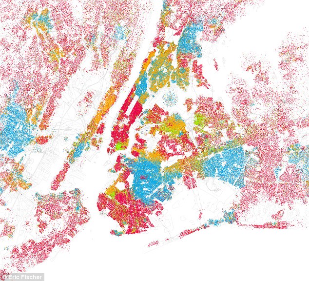
Eric Fisher’s digital race map of New York City
Manhattan is the phallus-shaped object in the middle (how appropriate for the world capital of our phallocentric civilization), pointing south by south west toward, as it were, the womb that is New York Harbor. The narrow white rectangle in the middle of Manhattan is Central Park, the absence of color meaning that no people reside there. To the west of Manhattan, across the white Hudson River, is New Jersey, but I don’t understand why the vast area immediately to the west of the eastern edge of New Jersey is white, indicating no population there. Yes, there are a lot of highways there, and the Meadowlands, but the non-populated area seems way too large. The map makes the eastern edge of New Jersey look like a long, narrow peninsula
There is a fascinating symmetry to Manhattan, with both the reddish-pink (Caucasian) East and West Sides turning orange (Hispanic) above 100th Street on the East Side (Spanish Harlem) and above around 130th Street (Harlem Heights, Washington Heights, and the Dykeman area) on the West Side, with the solid blue (Negro) of Harlem nestled between the two orange-colored extensions to its east and west.
- end of initial entry -
Karl D. writes:
You said:
“but I don’t understand why the vast area immediately to the west of the eastern edge of New Jersey is white, indicating no population there.”
That bothered me as well. I went on Google Earth to take a look at satellite photos of that section of Jersey. While there seems to be some unpopulated industrial space as well as open marshland, the white space does seem to cover a giant swath of that part of New Jersey which does have homes. But I think the cartographer got it right in the broader sense. At least as far as the Manhattan map and San Francisco. Two cities I know well. While the 96th street cut off on the upper East side is almost comical ( white people do live above 96th st.) it is largely true that that is a clear demarcation line between the mostly white Yorkville extension and Spanish Harlem.
Ken Hechtman writes:
You wrote:
I am skeptical of digital cartographer Eric Fischer’s much-bruited colour-coded maps showing the racial breakdown of large American cities, based on the 2000 census. Look at his map of New York City, for example. Is all of Manhattan below Harlem, with the exception of Chinatown (which is green), all-white, as indicated by its solid reddish-pink color? Of course not. It is very mixed. Perhaps whites are the plurality throughout the main part of Manhattan, but the map makes it look as though the area is all-white.
You’re right. Dot-mapping produces deceptive results when the density of the dots isn’t uniform. Midtown Manhattan isn’t really whiter than Long Island, but because the population density is so much higher in Manhattan, the red dots make the blue and yellow dots hard to see, especially at low resolution.
Look at the Lake View and Lincoln Park neighborhoods (fourth and fifth black outlines from the top, along the lakefront) in this dot-map of Chicago.
Here those neighborhoods look all-white, much like Midtown does in the New York map. Now click on the map to enlarge it and look again. At the larger scale, you can see that Lake View and Lincoln Park are mostly white but not all white.
Bill writes from Virginia
The text of the Daily Mail article is pure PC—e.g., “in Los Angeles, the Latino population dominates the poorer areas of the city,” meaning that the Latinos were initially wealthy, but were forced to live in a “poor area,” whereupon they became poor.
More maps by Fischer can be found here (also pages 2, 3, and 4)
Even from these small maps the concentration of blacks (in blue) in specific areas of town is obvious. Clicking on the small images brings up a high-resolution map. The most striking is Newark.
The map of Miami shows what blacks (blue) and Hispanics (orange) think of each other.
LA writes:
As conservatives we shouldn’t say that people choosing to live among people like themselves means that they dislike or hate other people. That’s the liberals’ game, according to which the only alternative to the total racial integration of all mankind is hatred.
Off-topic, but how do non-Hispanic liberals develop the proper pronunciation of “Latino”? The peculiar PC pronunciation of that word strikes me as different from any other Spanish word, partly because, I suppose, it’s not a real Spanish word but a word invented for political purposes.
LA to Ken Hechtman:
Thanks for pointing out that out. Of course.
Ken Hechtman replies:
I make similar sorts of “who lives where” maps for election campaigns using marketing segment data. For the campaign’s purposes, there’s no difference between a block containing very few people from the demographic of interest and a block containing none at all—they’re going to bypass them both. So I can safely discard all the information about secondary demographics and simply color-code the blocks according to the primary demographic and that’s good enough.
But here, the claim that a neighborhood is not just mostly white but exclusively white is incredibly politically charged. It conjures up all sorts of historical ghosts—restrictive covenants and “don’t let the sun set on you here” and all rest of it. If you’re going to make or even imply that accusation, it had better be true.
LA replies:
Guess what? I’m such an innocent I hadn’t even thought of that. Again, of course you’re right.
Bill from Virginia writes:
I wrote:
The map of Miami shows what blacks (blue) and Hispanics (orange) think of each other.
LA wrote:
As conservatives we shouldn’t say that people choosing to live among people like themselves means that they dislike or hate other people. That’s the liberals’ game, according to which the only alternative to the total racial integration of all mankind is hatred.
Good point; but black/Hispanic residential segregation may be more than just normal ethnic solidarity, e.g., this, from National Society for Hispanic Professionals, 2007:
“Animosity between Latinos and blacks is the worst-kept secret in race relations in America. For years, Latino leaders have pointed the finger of blame at blacks when Latinos are robbed, beaten and even murdered. Blacks, in turn, have blamed Latinos for taking jobs, for colonizing neighborhoods, for gang violence. These days, the tension between the races is noticeable not only in prison life and in gang warfare (where it’s been a staple of life for decades) but in politics, in schools, in housing, in the immigration debate. Conflicts today are just as likely—in some cases, more likely—to be between blacks and Latinos as between blacks and whites. In fact, even though hate-crime laws were originally created to combat crimes by whites against minority groups, the majority of L.A. County’s hate crimes against blacks in 2006 were suspected to have been committed by Latinos, and vice versa, according to the county Commission on Human Relations. Across the country—in Plainfield, N.J.; Jacksonville, Fla.; Annapolis, Md., and Indianapolis, Ind., among other places—the clash between black and brown has drawn attention, and lots of it, because it involves two groups that some think should be natural allies.”
Half Sigma writes:
My apartment building in midtown has about 100 units, and there’s only one black person living in the building. So I think the map is
probably correct.
Posted by Lawrence Auster at September 25, 2010 03:06 PM | Send